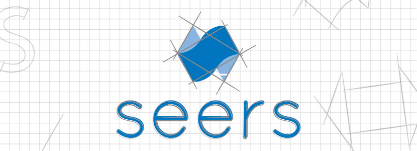
When considering an update to the Seers brand, we knew there were a number of cultural aspects of our business we would like to incorporate, as well as elements of the original logo we would retain. We started our redesign with the S for Seers, which has been part of the logo since its inception. One of the key cultural aspects we wanted to represent was the fact we are proudly Australian owned and operated. Hence, incorporation of a map of Australia. Secondly, we included a symbol of infinity to illustrate our commitment to continuous learning. Finally, and perhaps most significantly, we brought in an arrow illustration to highlight what we do best; building and deploying distribution and supply chain management systems.
Below are some of our workings towards the new Seers branding:
Seers Web Systems
Seers started as a family business and the name ‘Seers’ originates in our family tree. It also derives from the plural of Seer; someone who sees visions of the future. The latter meaning is befitting of our business services. We identify as a team of professional ‘seers’, in the business of building software that will help our clients forecast and plan into the future.
Australian Owned
We are a proud, family-owned business operating from Brisbane, Australia. While we work with multinationals from across the globe, and even have staff in Europe, we will always call Australia home.
Continuous Learning
The team at Seers are always learning. We encourage our people to keep trained in the latest trends and technology for their own personal benefit, as well as the benefit of our clients. Our commitment to continuous learning ensures our business can continue to provide the best solutions to our clients.
Delivery
First and foremost, Seers builds and deploys state-of-the-art supply chain and logistics systems. The arrows in our logo, pointing in both directions, highlight the concept of logistic system design as a fluid two-way process. The more we know your business and the more informed you are as we progress through solution design, the more successful the final product.
Seers Brand Process
We began developing our corporate elements into rectangles to create two arrows overlapping one another. Similar to an M.C. Escher piece, we wrapped the top and tail of each end so they appeared to go around the back of the logo in an infinite loop. A wave in the form of the letter S transformed the front rectangle, and the resemblance of an Australian map appeared. A little tidying up and the new Seers logo outline was complete.
Seers Corporate Colours
The original Seers branding was a single royal blue per below.
![]()
In keeping with tradition, the decision was made to retain this colour and to accompany it with a complementing lighter blue, providing the logo with more depth. We believe these colours represent our corporate professionalism, as well as our easy going and communicative work ethic.

Recent Comments